Oh no, here come the onions
Written by @marcemarc on Tuesday, 10 October 2017
"Is he done talking about picking media yet?"
No, I’m not done... and is anything ever done? Each small change influences the experience and tramples over what next...
Embrace:
”ooh, what would be good if...”
In short a butterfly beating its wings in New Mexico can cause a hurricane in China, so who knows what global natural disasters have been triggered by the affects of our tinkerings, prototyping and implementing of the small changes I’ve been detailing in this ‘no longer a trilogy’ of blog posts...well hopefully it’s not just wind.
Keen followers of the series will know we are using light touches to speed up the editors’ ‘writing articles and picking images’ experience in Umbraco, as they switch and learn to adjust to Umbraco 7 - we want them to feel like the wind is behind them and they are not having to fight gusts of outrageous cms implementation. Umm It’s time to switch analogies:
I’m thinking that when you cook with an onion, perhaps you are making a Lasagne or French Onion Soup (see the recipes section of this site for further inspiration), there comes a point when you remove the first papery layers of the onion and are ready to slice and dice, but underneath there is perhaps revealed another wrinkly layer, or a strange black mark, and well, you don’t quite fancy it, and you peel off the next layer in the hope that underneath is something pure and unblemished that you can happily slice into... you may need to buy more onions to conjure your French Onion soup to perfection (p9 of the tooorangey cook book), but in your opinion it will be worth it to serve at your sophisticated dinner party later on - however if you are on a budget, well, the aim is perhaps simpler, to peel the layers. really, to just get to something that you don't think will kill you.
With software development similar levels of pragmatism can come into play when you consider project budget vs features vs time. If you have agreed to deliver a feature for a certain amount of money - it is open to interpretation when that feature has been delivered, you may work for much longer on that feature than you had considered, because as the feature begins to be realised, the client (and also the developer) starts to have/spark off ideas and sees what the potential of the feature could be. This can lead to a problem where the developer just wants to be finished, and get paid, and the client just wants the feature to be like they now in hindsight understand they would like it to be, and this isn’t the best atmosphere for creativity or fun.
Digression: Software development isn’t similar to the process of building a house, as people are often keen to suggest
- maybe it would be, if the thing you were building was something you and your client had had a lifetime of experience living in / visiting other people's houses to eat French Onion Soup in or even had just watched several episodes of Grand Designs back-to-back together on the telly so had some shared understanding of what was possible, oh and that the new eco light aluminium window frames from Germany might arrive late -
in good software, like cooking, you may follow a recipe but ultimately if it needs more salt, you don't argue the toss about the salt being out of scope for this phase of the soup...
development by definition is an event constituting a new stage in a changing situation.
So however you approach it, software will ‘develop’ incrementally, but how can you enable this so the client and developer know when a feature is done without falling out? - since pretty much everything you look at can be improved upon in some way? I sometimes wonder if development is just a seesaw of embarrassment between client and developer, and the development stops when the client is too embarrassed by the effort gone in to suggest any more changes, and the developer is not embarrassed by the quality of what they have shipped.
The first one to mention "Is that a showstopper, perhaps we could revisit this in Phase 2" is the first party to realise they never want to work with the other person again. The client changed their mind, the developer didn't understand.
I've talked at length before about managing expectations, and how under promising and over delivering is kind of much better than the other way around, and it's ok to 'not know'.
But there is another way to trigger a different atmosphere on a software development project, and that is to identify a common enemy, that the developer and client can unite against, and my favourite common enemy to use of late is time.
Having some kind of limiting reign over ‘what can be done’ within a software project may feel restrictive, but actually is really helpful for ensuring some pragmatism and stimulating clever and creative solutions, more importantly though it can keep the client - developer harmony intact, because they are ‘in it’ together, to try and get something delivered 'within the time'.
(Tip: Don't use money as the common enemy - nobody enjoys being told the don't have enough money, and people can always unexpectedly find extra money, and then people get upset if they don't get what they thought they were getting for their money - so use time, time is the best common enemy - it is not controversial and it's easy to understand… "the Dinner Party is at 7pm, I do not have time to peel twenty onions" - "we are effectively homeless next Tuesday unless the roof is on". (a waterproof covering of some devising is therefore much better here than half a perfect roof, or indeed the bowl of French Onion Soup the project plan said you would deliver on Tuesday).
The conversation becomes not “When will feature x be ready?” but “On x-day what features will we have?”.
Against the common enemy of time, it’s easy for the developer to show they are doing their best within the timeframe, and easy for the client to understand how long things take - particularly if you have a daily show and tell of the progress, and plot together against the common enemy.
It feels wrong, but once freed from the constraints of perceived perfection, and architecting 'the whole thing' you can start to enjoy working with your client comrade on delivering simpler smaller things quickly that focus on the immediate needs, stepping stones to where you want to ultimately get to, but with the flexibility to get somewhere else if it seems like a better place to go along the way.
"This is a lot of waffle...normally in these posts, we skim read and put up with some of the waffle, but then there is a link to some code we can sneak a look at and perhaps repurpose - when is that bit happening?"
Well, let me try to illustrate the above with an example.
We upgraded a magazine site to Umbraco 7, 250,000 media images, I’ve mentioned a bit about it in previous posts. After the upgrade two weeks were put aside for ‘other improvements’ - and the immediate concern they had was the speed of the ‘Uploading and Picking of Images’ journey, it was slow in Umbraco 6, and the upgrade hadn't really altered this perception.
The first thing to note here is we’re not ‘implementing a feature’, we’re improving a process, we’ve not agreed exactly ‘how’...
... we thought about architecting a new kind of Super Media Picker, building something from scratch to address any problems, perhaps working with examine, but in 2 weeks?
... instead we investigated:
Upload speed - at trade shows it was taking 12 minutes to upload an image, which was frustrating as the client were trying to cover ‘what was happening now’ as events unfolded... and not what happened 15 minutes ago. I immediately assumed this was something to do with mobile device connectivity at the event. So we set about proving this, I uploaded a file from my mobile, in an area of good reception and noted how long... umm it was 12 minutes - so I tried from my desktop, err 12 minutes - it was nothing to do with the shows! Back in the office they uploaded images in batches of 8+ to use within an article, so accepted this would be slow… and went off to make a cup of tea - they didn’t experience the single image upload problem until they were at a show.
This was weird, never seen nothing like this in an Umbraco site before...had we missed something in the upgrade?… we set up a vanilla install of their version of Umbraco, and pointed it at their database, and attempted to upload: 12 minutes again. The images were stored in blob storage... we turned off blob storage temporarily, 1 minute upload…. 250,000 images, would blob storage deteriorate with that number of images? (that’s not how the cloud is meant to work!). Darren stepped through the upload process, and found, the image upload part was actually really quick... but have you ever wondered where the number comes from in your media url: /media/12345/yourfile.jpg ? - well this was the cause of the stupid ten minute delay. It's calculated by looping through all the directories in the media folder and finding the one with the highest number:
_folderCounter = 1000; // seed
   var directories = GetDirectories("");
   foreach (var directory in directories)
   {
    long folderNumber;
    if (long.TryParse(directory, out folderNumber) && folderNumber > _folderCounter)
    _folderCounter = folderNumber;
    }
This performs reasonably well for a file system on a server even for 250,000 folders, but in blob storage the performance is awful (blob storage is not designed to be queried in this way).
(The good news is now that media in Umbraco has a guid, the latest versions of Umbraco can use this in the calculation of the unique media url, and this iteration won’t need to occur.)
To work around this in the meantime, in the simplest way, we created a hybrid File System Provider, that used Blob storage for storage, and the file system, for the calculation of the next number.
So the nice thing here was it was really easy for the client to understand the problem, we showed them the code above, and they could get why it might be slow with 250,000 images.
Did this mean the File Upload and Media Picking journey was quick enough?
No, we had just peeled off one layer of the onion, the client could see some more blemishes.
Picking Images
Images were now uploaded in a comparatively astonishingly quick time but ‘picking them’ was still slow..
We looked at the Media Picker and found, it was slow, the client had tons of images arranged in Alphanumeric folders, and subfolders eg
[Article Images] - [B] - [BR]
And each click along the breadcrumb to drilldown to the images gave no indication that the media items were loading, encouraging further 'impatient from waiting' editor clicks, resetting the request and slowing things down further.
We added a loading indicator, so at least the editor knew to wait…
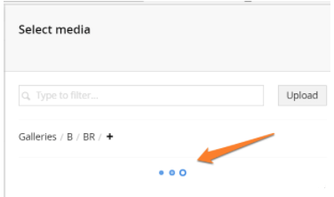
(this is now coincidentally been added to the core in 7.6.x)
This meant that although it was no quicker, it felt quicker, because the editor had feedback something was happening. (My favourite kind of small fix).
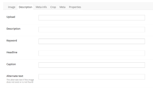
But why was it slow on each folder request?, we found that all the images for a folder were being requested without paging (although this looks to have been addressed in v7.7)... for each folder click, there could be hundreds of images, and for each image, along with the generation of a thumbnail, all of the Media Type's properties were being returned (when the media picker perhaps only really needs Image, Name and Id?). This particular site compounded the problem though - in an attempt to use the Media Section as some kind of Media Library the default Media Type Image had an additional 23 properties (instead of just width, height, size type etc)
 .
.
Each of these additional properties were being retrieved in the blob of Json for the Media Picker to display the images to pick (all via the MediaService, eg db requests), this additional unrequired data on the request was overwhelming the browser (Over 2mb of Json)...
...again we were thinking, stop, new Media Picker + Examine/Azure Search, but again a bigger task than the common enemy time would allow.
Understanding this the client agreed we could drop some of the media type properties, (you can see from the screenshot they weren't filled in very often), and we figured we could scale up the database a notch in Azure, it would cost more but the trade off was faster picking, it would be worth it, but whilst looking at the queries that were being executed, Tom Pipe had a hunch that the database wasn't performing as quickly as he'd expect (it was already scaled up, it shouldn't be this slow).
Digging into SQL he found a thing, which we all remember from the old days, but as we're not DBAs anymore we'd collectively forgotten about:
Heavily fragmented SQL indexes
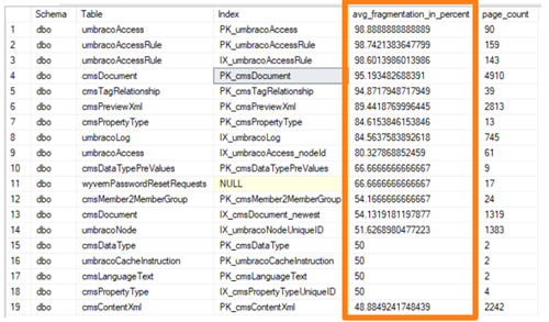
(And we’ve since found this on many of the Umbraco sites we support, particularly those upgraded from 6 to 7)
The advice from Microsoft is to rebuild your sql indexes if they are over 30% fragmented, and reorganize if they are greater than 5% but less than 30%.
https://docs.microsoft.com/en-us/sql/relational-databases/indexes/reorganize-and-rebuild-indexes
Tom being Tom, built a custom healthcheck to test for fragmentation and allow you to rebuild/reindex as necessary from the backoffice:
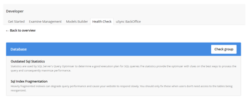
Which he says he's definitely going to release, so why not remind him once a day on twitter: @toepimp until he does.
Anyway you can see the result of rebuilding the indexes on database performance generally, and the speeding up of the MediaService Api’s GetChildren:
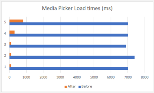
We didn't need to scale up the db, in fact two weeks later we scaled it down a notch!
So are we there yet?
Has the final layer of the onion been peeled?
… not quite.
Media picker in a Macro
One editor was reporting the media picker was slow, when used via a Macro to insert an image into the Rich Text Area. What could be different about using the Media Picker as a Macro Parameter we thought? We investigated and found no difference, we arranged a screenshare for the editor to demonstrate and the bottleneck was obvious:
When the editor hit the Insert Macro button, the macro selection dropdown appeared:

However the site only had one Macro! the slowness being reported by the editor was caused by the obvious frustration of having to pick the macro from a list of 1 in order to get to the Parameter Options that included the Media Picker... It felt clunky and slow, why doesn’t the insert Macro option go straight to the parameter options if they exist and it’s the only Macro defined on the site?
My first thought was shall we add a second Macro to insert something else, so it doesn't feel so pointless making the selection :-)
...but instead the workaround here was a new TinyMce Custom Plugin, that fired the opening of the Insert RTE Image, (and then the actual Media Picker overlay) so the editor had a quick way of getting to the insert image part, when they wanted to insert the image instead of faffing around with pointless dropdowns of annoyance making the picking process feel slow.
So tell me we can start cooking this Onion Soup now?
Nearly there...ready to peel another layer?
Media Picker List View
The final issue the editor reported having difficulties was an interesting one, essentially their articles might contain seven or eight images, all focussed on a specific technical aspect, and typically the images would be named:
Long and complicated feature picture 1.jpg
Long and complicated feature picture 2.jpg
Long and complicated feature picture 3.jpg
Which they would upload as a batch to the media section or on first pick via the media picker.
The problem here is that the images all sort of look a bit alike, with subtle variations, the media picker presents images to be picked, as umm thumbnails of those images, the editor knew the filename to insert where, but could not necessarily pick this image out of an identity parade. But you can hover over the image in the media picker and reveal it’s filename right? yes but..
Two problems, firstly you only see the first part of the name, so the distinguishing bit ...picture 3.jpg or ...picture 4.jpg was cut off - and secondly the images aren’t displayed in alphabetical order - their order is determined to best fit the image thumbnails into the picker overlay - and so you’d be hovering and guessing between each one trying to guess, if the next one, was the one, waiting for the hover to kick in.
I couldn’t really determine if this is a really niche problem or something that affects editors more generally, how common is it? it came up in conversation from the client that you’d think you’d be able to switch the picker to use a List View like in the Media Section.
And I'm a great believer in 'what you would expect to be able to do' to be perhaps what you should be able to do...
... but to do so would mean custom media picker, which we didn't have time to create, or could we tread lightly upon the existing picker?
intrigued, I started with the existing Media Picker, views and controllers and directives, and I created a prototype custom media list picker to explore the idea - attempting to change as little as possible, essentially creating only a custom Media List Directive to replace the umb-media-grid directive, so it had the same functionality as the grid view, but with a toggle to switch to a list view.
At any point in the media picking journey you can switch to see the ListView version, and the names of the images appear in full, and most importantly in alphabetical order, which is exactly what this editor needed. It speeds up their picking of media jouney when they don't know exactly what the image looks like, and less mistakes are made - anecdotally it's just less frustration, so again feels quicker.
You can examine the repo of the prototype here:
https://github.com/marcemarc/tooorangey.MediaListPicker
It isn’t really something that will work as a package, as the Media Picker evolves in the core, you’d have to keep evolving this, but if more editors might benefit from this feature, and it would be great to hear if people think this is a good idea - you could imagine it being added to the core Media Picker as an option?
Have added an issue to the issue tracker to gauge any interest.
http://issues.umbraco.org/issue/U4-10518
It’s a prototype, the editors are using it on the site, and feeding back (could we hover over the list item and see the image etc. can we have an option that shows the last 20 uploaded images - we always pick what we’ve just uploaded etc)
This small change is already sparking off different ideas for future improvements, and I know I ended up creating a custom media picker in the end - but it's very different to the one I would have architected at the start of the two weeks, and that prescribed version probably wouldn't have addressed any of the actual issues above, although it would have used examine/Azure search, and been ace in different ways, it would have been problematic in others...
Does this illustrate what I'm trying to say?
Peeling away the onion layer by layer, working with the client, beating the common enemy of the two week timebox to deliver something useful? The difference is the client is eager to do more, we're not arguing over the over-promised "Super Media Picker" being late, and that it turns out to also feel slow within a Macro, because of the dropdown... etc etc
Summary: If you want to choose a trade based analogy for software developers, I don't think that we're builders, nor architects, we are much more akin to gardeners, working with and against the changing seasons, we have experience, we know certain plants won't grow well in that soil, we work with the client, it's their garden, we advise, reflect on what's happened, each time we come, we listen, plan and improve the garden, but it's never finished.
... and we plant our own onions.
