Responsive images - roll on 4G...
Written by @marcemarc on Sunday, 17 November 2013

So my images are huge, and rendered huge regardless of browser, and responsive images are cool right now, (that's the ability to serve differently sized images at different compression rates for different devices.)
Normally on an umbraco project, my image resizer of choice would be Eksponent CropUp , which is built as a plugin for ImageResizer
And I tend to use this because of it's ability to suggest a crop based on what it thinks is the most important part of an image, using mathematics; but still allows editors to override this on the 10-20% of occasions when this isn't 'quite right', using jcrop. It's great !! - CropUp also has some responsive image functionality, but I've never quite got it to work.
The slight pain is ImageResizer doesn't do disc cache-ing out of the box, but there is a plugin for $99 - $249 per domain depending on usage: http://imageresizing.net/plugins/diskcache but who'd begrudge a few dollars for the cool stuff that it does ?
Anyway this is Umbraco 7.0.0 RC and CropUp is a legacy property editor, at the moment, and so I can't use it 'yet', and I have these huge images.
So alot of people been talking recently about slimmage.js which works with ImageResizer for "sane & simple effortless responsive images" and I guess this blog should be about trying stuff out.
So reading the info on Slimmage it says it works with any RIAPI-compliant image resizing tool but ImageResizer 'is preferred', and I thought RIAPI client, what's that ? https://github.com/riapi/riapi it's a work in progress 'standard' for parameters for QueryString image resizing tools by the , and I thought I wonder if I can use this with ImageGen, largely because, I'd get disc caching for free :-)
So ImageGen isn't RIAPI compliant, but alls thats different as far as I can see, is that Doug calls the Jpeg Quality value 'Compression' and ImageResizer calls it 'Quality', if only there was some kind of standard...
But this can be easily fixed in a variety of different ways, my super lazy approach is below.
How it works
The Slimmage.js / ImageResizer approach comes with a HttpModule called 'SlimResponse' https://github.com/imazen/slimresponse (you're following all this right ?) it's job is to look at the html page being served up, and if it contains an image tag, and that image has a class of 'slimmage' or the querystring has &slimmage-true then the image tag is hijacked and the html markup that slimmage.js works with is written out instead. Then slimmage.js looks at the browser width and varies the parameters sent to the serverside resizing tool based on the current screen width. So for small screens, a smaller image is dynamically resized and compressed, because slimmage.js has sent smaller parameters for width and quality via querystring.
Super lazy
So my super lazy approach to making this work with the non-RIAPI compliant Imagegen was to open up slimmage.js, and globally replace the word 'quality' with 'compression'.
et voila
slimmagen.js !!
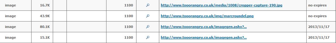
it seems to work, I have smaller images !!
- Originally
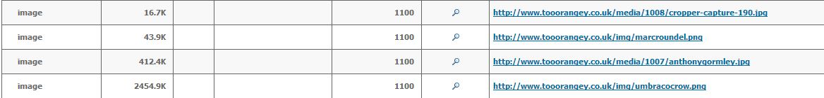
- Desktop + slimmagen
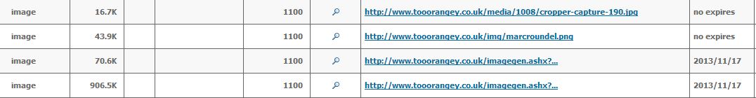
- Small Screen + slimmagen
What's good about slimmage.js is you can cms control which images should or shouldn't get slimmage'd (with a checkbox in mediatype, and write out class="slimmage" accordingly) I'm working on a project for a client, and I'm using cropup, and the ability to turn off cropping/compression for certain images has suddenly become very important.
The other approach that I like, was proposed sometime ago by OffRoadCode, basically you set a cookie in javascript on first page load that reports the max width screen of the device, and then a httpmodule uses this, coupled to imagegen to serve appropriate images to appropriate devices, if they're in the media folder, you can read about it here: https://offroadcode.com/blog/1540/mobile-friendly-images,-creating-responsiveadaptive-images-with-imagegen/ I might have a play with this too at some point. (be great if devices announced their max width size via user agent string: http://www.bigbossmas.com/web-development/list-of-mobile-device-sizes/)
For completeness I should also point out uAdaptiveImages exists http://our.umbraco.org/projects/developer-tools/uadaptiveimages a port of the Adaptive images project for responsive websites, but I haven't used it.
Be great to linkup the cropup 'suggest a crop' functionality and interface with ImageResizer cropping and ImageGen disc caching, and some kind of successful responsive approach: Umbraco 7 is a good opportunity to rethink and tweak the data types, (property editors) we know and love.
Wonder what it looks like on a retina display...